In the grand theater of branding and marketing, typography plays a lead role, subtly influencing perceptions and steering emotions. Just as a smile can speak a thousand words, the right typeface can personify your brand, connecting with your audience on a profound, unspoken level. In the era of digital media, the significance of choosing the correct font extends far beyond aesthetics. It can be the difference between a brand that resonates and one that simply fades into the backdrop of consumer consciousness.
Contents
Introduction to Typography and Branding
As we navigate the increasingly digital landscape of modern business, there’s an aspect of branding that often gets overlooked: typography. A fundamental component of any visual communication, the fonts we choose can either invigorate our brand identity or leave it languishing on the sidelines. Welcome to “Finding Your Font: Typography Choices That Elevate Your Brand,” where we’ll demystify the art of typography and reveal how you can use it to elevate your business.
Your brand is more than just your logo or color scheme — it’s your company’s persona, its public image, and, most importantly, the promise you make to your customers. In a saturated market, a robust, well-defined brand identity is crucial for distinguishing yourself from competitors and fostering loyalty among customers.
This is where typography enters the scene. When executed well, typography becomes an incredibly effective tool for conveying your brand’s values, personality, and promise—without uttering a single word. Every font has a unique ‘voice’ and ‘mood’, which can reflect and accentuate the character of your brand. It can make your brand appear more professional, more fun, more innovative, or even more approachable—depending on your choice.
Understanding the Basics of Typography
Typography, at its most basic level, is the art of arranging type. It encompasses everything from font choice and size to spacing and alignment. However, typography is more than just a design element. It’s a powerful tool that can significantly affect how your audience perceives your brand and interprets your message. Good typography enhances readability, draws attention, creates hierarchy and brand recognition, evokes emotion, and subtly conveys your brand’s personality.
Types of Fonts: Serif, Sans Serif, Script, and Display
As you begin your typography journey, it’s important to familiarize yourself with the main categories of fonts [1]:
- Serif fonts have small decorative strokes—called serifs—at the end of their letters. Examples include Times New Roman and Georgia. These fonts are often used by traditional, established brands to convey a sense of trust, respect, and authority.
- Sans Serif fonts, such as Arial and Helvetica, lack the decorative strokes that serif fonts possess. Their clean, modern look makes them a popular choice for tech companies and startups aiming for a minimalist, sleek, and contemporary image.
- Script fonts mimic handwriting and calligraphy. These fonts, like Lobster and Pacifico, can range from casual to formal. They’re often used by brands seeking to project elegance, creativity, or a personal touch.
- Display fonts are usually more decorative and used for large headings or logos. Fonts like Impact or Bebas are bold and attention-grabbing, used to make a strong visual impact.
Remember, each font category can set a different tone, and selecting one should always be guided by your brand personality.
The Psychology Behind Different Font Types
Behind every font type, there’s an underlying psychological effect. For instance, serif fonts often evoke feelings of tradition, reliability, and respectability. On the other hand, sans serif fonts tend to convey a sense of modernity, simplicity, and straightforwardness. Script fonts can inspire thoughts of elegance, creativity, and warmth, while display fonts are all about making a bold, unmissable statement. Understanding these psychological associations is key to leveraging typography effectively in your branding efforts.

Aligning Typography with Your Brand Identity
Now that we’ve covered the basics of typography, let’s delve into the heart of the matter: aligning your font choices with your brand identity. The objective is to create a visual language that effectively conveys your brand’s personality, tone, and values to your target audience.
Importance of Consistent Branding
Consistency is key in branding. It helps establish familiarity, build trust, and strengthen brand recall. Every design choice—including typography—should reflect your brand’s identity consistently across different platforms. When your fonts align with your brand personality, they act like a harmonious chorus, amplifying your brand’s message and image. For example, a luxury brand might opt for an elegant script font, while a tech startup might lean towards a clean, modern sans serif [2].
Factors to Consider: Industry, Target Audience, Brand Personality
Choosing the right typography involves considering various factors.
Industry
Different industries often have distinct typography trends. For instance, legal firms might use traditional serif fonts to convey authority and trust, while advertising agencies might use more playful, creative fonts to showcase their innovative thinking.
Target Audience
Understanding your audience’s preferences and expectations is crucial. If you’re a children’s book publisher, fun, easy-to-read fonts might be more appropriate than the sophisticated script fonts a high-end jewelry brand would use.
Brand Personality
Your brand personality should guide your font choices. Is your brand playful or serious? Modern or vintage? Premium or affordable? Each of these traits can be expressed through different font styles.
Case Studies: Successful Branding Through Font Choices
Let’s look at a few examples of successful branding through font choices:
Coca-Cola
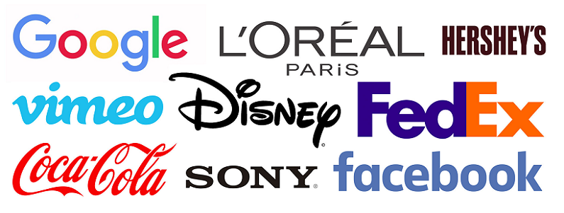
Coca-Cola uses a custom script font that has become synonymous with its brand. The font helps evoke feelings of fun, nostalgia, and refreshment, aligning perfectly with their brand identity.
The New York Times
This media outlet uses a classic serif font, projecting an image of reliability, authority, and prestige. It aligns with their brand as a trusted source of news.
Google’s simple, clean, sans serif logotype reflects its brand personality: user-friendly, straightforward, and innovative.

Essential Typography Terms You Need to Know
As you move deeper into the world of typography, you’ll encounter specific terms that describe the intricacies of fonts and their arrangement. Understanding these terms will not only help you communicate your brand’s typographic needs more effectively but also refine your font choices.
Explaining Key Terms: Font, Typeface, Kerning, Leading, and Tracking
Font vs Typeface
These terms are often used interchangeably, but there is a subtle difference. A typeface refers to a family of related fonts (like Helvetica), while a font refers to a specific style and weight within that typeface (like Helvetica Neue Bold) [3].
Kerning
Kerning involves adjusting the space between individual letter pairs to ensure they’re visually balanced. Good kerning enhances the readability and appearance of your text, particularly for logos and headlines.
Leading
Leading (pronounced ‘ledding’) is the vertical spacing between lines of text. Optimal leading improves readability, particularly in large blocks of text.
Tracking
Tracking refers to the uniform adjustment of spacing between all characters in a piece of text. It’s often used to fit text within a certain area or to create a certain aesthetic effect.
How These Terms Influence Typography Choices
Understanding and applying these terms can significantly impact your typography choices [4]:
Font/Typeface
Choosing the right font or typeface is the first step towards creating a brand-consistent typography. Your chosen font should reflect your brand’s personality and resonate with your target audience.
Kerning
Well-kerned text not only looks more professional but also significantly improves readability—especially for your brand name or logo.
Leading
Correct leading is essential to ensure your content is easy on the eyes and keeps your audience engaged, particularly in long-form text like blog posts or books.
Tracking
Adjusting tracking can change the overall look and feel of your text, allowing you to evoke different moods or even improve readability.

Practical Steps to Choose Your Brand’s Typography
We’ve discussed the fundamentals of typography, its psychological effects, and alignment with brand identity. Now, let’s take a step-by-step approach to choosing the typography that best represents your brand.
Identifying Your Brand Personality
Start by defining or revisiting your brand’s personality. Is your brand traditional or modern? Professional or casual? Luxurious or affordable? Identifying your brand personality will guide your font selection and ensure that your typography resonates with your audience.
Matching Font Styles with Brand Personality
Once you’ve defined your brand personality, it’s time to match it with appropriate font styles. For instance:
- If your brand is traditional and reliable, you might opt for a classic serif font.
- A modern, minimalist brand might be best represented by a sleek sans serif font.
- A brand that exudes luxury and sophistication could go for an elegant script font.
- An innovative, creative brand might choose a distinctive display font.
Remember, your chosen font should evoke the same feelings as your brand personality.
Considering Readability and Accessibility
While aesthetics are important, the primary function of typography is to facilitate reading. Always prioritize readability and accessibility. Keep in mind factors such as font size, color contrast, kerning, leading, and tracking to ensure your text is easy to read across different devices and for people with visual impairments [5].
Testing Typography Across Different Platforms
Once you’ve selected a potential font, test it across different platforms and in different contexts (like headings, body text, or captions) to ensure it works well everywhere. This includes your website, social media, print materials, and any other places your brand is represented. The key here is to maintain a consistent visual identity.
Using Typography to Enhance Your Brand’s Visual Hierarchy
Visual hierarchy is the arrangement and presentation of design elements in a way that signifies importance. It guides your audience’s eyes through your content in the intended order of priority. Typography plays a crucial role in creating this hierarchy, helping to organize your information effectively and making it easier for your audience to understand your message.
The Role of Typography in Visual Hierarchy
Typography can enhance your brand’s visual hierarchy in various ways:
- Size: Larger text naturally draws the eye first, so your most important information (like headlines or call-to-actions) should generally be in a larger font size.
- Weight: Bold or heavy fonts can also attract attention and are often used for emphasis or to highlight important points.
- Color: Different colors can not only represent your brand but also help differentiate between types of information or indicate importance.
- Position: Where text is placed on a page can also influence the order in which it’s seen. Typically, Western readers scan pages from top to bottom and left to right.
Creating a Typographical Hierarchy
Creating a typographical hierarchy involves deciding which information is most crucial and needs to be noticed first, then using the principles above to achieve this. Here are some simple steps to create a typographical hierarchy.
Determine the Order of Importance
Start by determining the order of importance of your content elements. For instance, in a blog post, the title is usually the most important, followed by subheadings, main text, and then side notes or captions.
Apply Typographical Differences
Apply different font sizes, weights, styles, and colors to these elements according to their level of importance. For example, titles might be the largest and boldest, subheadings slightly smaller but still bold, and main text in a standard size and weight.
Test and refine: Finally, test your hierarchy to see if it guides the reader’s eye as intended. Refine if necessary.
References
[1] Awesome typography tips on how to elevate your designs
[2] The Art of Copy: Choosing the Right Typography for Your Brand
[3] Brand Expression: Typography
[4] Font Types: What These 4 Say About Your Brand
[5] 12 Best Business Fonts to Give Your Brand an Impressive Look
